ShopDreamUp AI ArtDreamUp

Deviation Actions


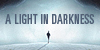

Description


Image size
1772x2575px 1.24 MB
Make
Canon
Model
Canon EOS 50D
Shutter Speed
1/80 second
Aperture
F/5.6
Focal Length
41 mm
ISO Speed
100
Date Taken
Jan 27, 2012, 6:43:28 PM
Sensor Size
8mm
© 2013 - 2024 shiny-shadows-Art
Comments251
Join the community to add your comment. Already a deviant? Log In
We'll start with my rating , and I'll explain in each why with hopefully helpful critique <img src="e.deviantart.net/emoticons/s/s…" width="15" height="15" alt="
Vision this time is 4 stars , it's a clear image , but a bit too contrasted / bright. the hands and what look like her knees are a little dark compared to the rest of their flesh , but is a warmer feel to the sensual image it's meant to be.
Originality is 5 stars , everyone can create an image like this and everyones image would be different because we all add our own personal flair to an images appearance <img src="e.deviantart.net/emoticons/s/s…" width="15" height="15" alt="
Technique is 5 stars because your method is very fluid and looks good. what you're doing really does work for you and is your own personal style
Impact I also gave 4 stars for mainly the same reason as the vision. it's a little bright. if it had a warmer tone to it I feel it'd hit me harder and leave me with that WOW kind of impact.
with the tones you've used in the image , if you're overall happy with how it is , the other suggestion I'd recommend is a new layer over the entire top of it ( one of my own tricks.. )
fill it with a color that suits , for this one I would use a dark yellowish gold , or even a kind orange ( since I see a hint of orange near his hair )
set paint bucket to overlay opacity 50% and tolerance 32 , try color #80411e and fill a new layer with it. adjust the layer to linear light and 75% opacity.
in my opinion it gives a little more of an orange rather than yellow tone to the image making it warm and passionate. just need to brighten his more visible eye iris a bit and spot on <img src="e.deviantart.net/emoticons/b/b…" width="15" height="15" alt="
but , as in any critique , this is only my opinion with suggestions
and the orange tip is from my own experiment of the image with just a layer over it to help give a better critique.
( your rose fairy was so much easier to point in right direction , these guys bring out another style / technique that I use when having a hard time with something )
hope you like my critique , and most of all I hope you find it useful and helpful <img src="e.deviantart.net/emoticons/h/h…" width="15" height="13" alt="